EMAIL: sales@orpinegift.com

Views: 543 Author: Publish Time:2025-09-08 10:34:35 Origin: Colshine
If you sell or showcase lapel pins, you know one truth: people decide in seconds. From across a booth aisle or on a scrolling feed, a pin either reads instantly—or it gets skipped. This post breaks down a practical approach I call the one-meter rule: design and produce your pins so they’re recognizable, readable, and desirable from about one meter away. It’s a small shift that makes a big difference in sales and engagement.
Stand back one meter from your screen or printout. Can you identify the subject and main shapes without squinting? If not, simplify.
Ideal sizes: 25–35 mm (1–1.4 in) covers most designs. Micro pins (20 mm) work only with bold silhouettes. Oversized pins (40 mm+) allow detail but increase cost and weight.
Silhouette first: Prioritize a strong outline (character head, emblem crest, icon shape). Complex line art looks great up close but disappears at distance.
Soft enamel and hard enamel aren’t just finishes—they change how your art reads.
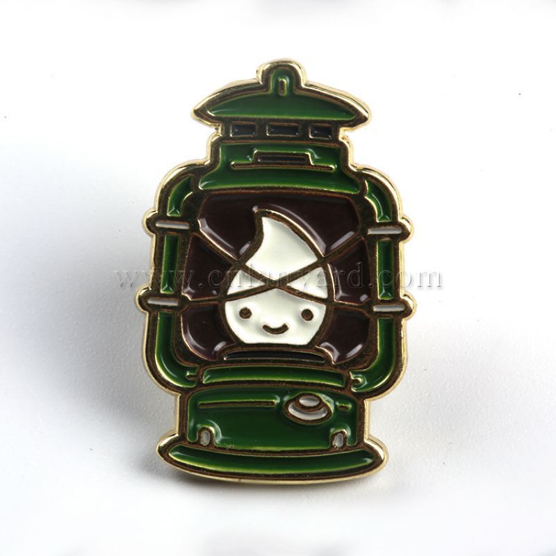
Soft enamel: Recessed fill with raised metal lines. Great for texture, bold contrast, and a classic pin look. Works well under normal lighting.
Hard enamel (polished smooth): Sleek, premium, flat surface that handles everyday wear better. Excellent for logos and corporate branding.
When you need tiny text or gradients: Add screen print for micro text or crisp logos; use offset print under epoxy for gradients or photo-style art.
Production realities matter. Thin lines look fine on screen but fail in metal.
Minimum metal line: 0.2–0.3 mm (about 0.008–0.012 in) for reliable die-struck pins.
Minimum enamel gap: 0.3–0.4 mm so colors don’t bleed.
Small text: Avoid if you can. If you must, use uppercase sans-serif and screen print it.
Negative space: Treat it like a color—leave breathing room around key features.
Pins live in imperfect light (trade show halls, dim bars, outdoor markets). Build contrast into the art:
Pair light enamel with dark metal (black nickel, gunmetal) or dark enamel with light metal (gold, silver).
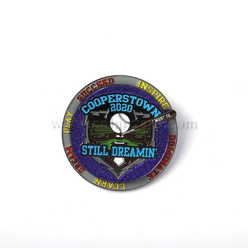
Limit to 3–5 colors for clarity. Use Pantone matching for brand accuracy.
Add sandblasting or matte plating to kill glare and make details pop.
Your metal choice changes the whole vibe:
Gold: Warm, premium, great for vintage or celebratory themes.
Silver/Nickel: Clean, modern, tech and corporate friendly.
Black Nickel/Gunmetal: High contrast, edgy, perfect for pop culture or bold art.
Antique finishes: Add depth to 3D or textured designs (think antique gold/bronze).
3D die cast: Best for sculptural subjects (skulls, crests). Keep features bold.
A beautiful pin that falls off is a refund waiting to happen.
Rubber clutches: Comfortable on clothing; great for casual wear.
Butterfly clutches: Classic and secure.
Locking pin backs: For heavier pins or high-value collectors—upsell opportunity.
Double posts: Use on larger pins to prevent spinning.
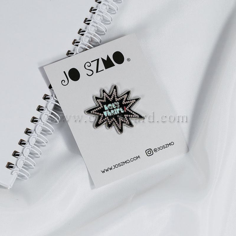
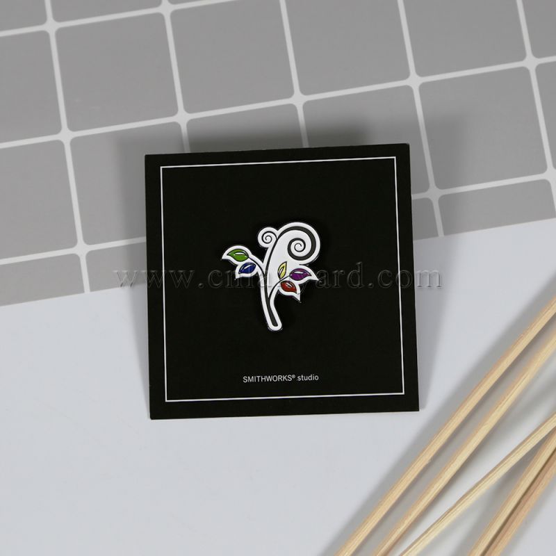
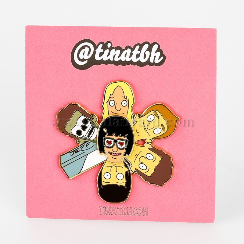
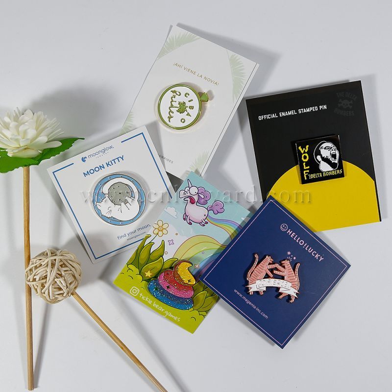
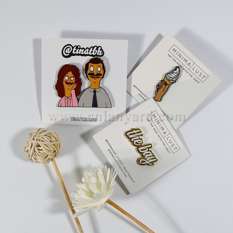
Backstamp & card: Add your logo and URL to the backstamp; design a branded backing card for retail-ready presentation.
Make your manufacturer love you:
Vector art (AI/EPS/SVG) with strokes expanded.
Metal color map: Clearly indicate plating and which lines are metal.
Pantone codes: List solid coated numbers for each enamel.
Callouts: Note special processes—glitter, glow, epoxy, screen print areas.
MOQs: Commonly 50–100 pcs per design; unit cost drops at 300+.
Molds: One-time mold/die cost can be reused for reruns.
Finish add-ons: Glitter, glow, specialty platings add cost and lead time.
Timeline: Typical production 10–20 days after proof approval; pad extra time before events.
Pins are impulse-friendly. A great backing card with a story, a clear sleeve, and a tidy display stand can lift conversion. For online orders, add a tiny care card and a thank-you note; it boosts reviews and repeat buys.
Strong silhouette and limited colors
Lines ≥ 0.25 mm and enamel gaps ≥ 0.35 mm
Proper plating for contrast
Backing chosen for weight and use case
Vector files with Pantone callouts
Branded backstamp and retail card
Hard enamel vs soft enamel—which should I pick?
Hard enamel is smooth and durable—great for logos and daily wear. Soft enamel has raised metal lines and texture—great for pop and contrast.
Can I use gradients?
Yes, via offset print under epoxy. For traditional enamel, stick to flat spot colors.
What size is best for events?
28–32 mm hits the sweet spot for visibility, comfort, and cost.
What file format works best?
Vector (AI/EPS/SVG). If sending raster, use 600–1200 dpi at 100% size.